Showing posts with label construction. Show all posts

Wednesday, September 10, 2014

Tin Beer Signs

The last time I did Always...Patsy Cline, I was able to get a wonderful Schlitz beer neon sign from a friend who is a beer distributor. 
This time around I was hoping I could use the same tactic. Since this show wasn't in Chicago, I couldn't go through the same friend, but I figured I would just contact the distributors who service Door County Wisconsin to see if they would be willing to help (we have a bar on property at the theatre so there was already a bit of a relationship between the theatre and the distributing companies). I made several phone calls and was always able to talk to very helpful-sounding people who assured me that they would pass my message along to the correct person and that I would hear back from them soon.  I would wait a couple days, not hear anything, and then call back again, with the same results. Eventually I decided that I wasn't going to be able to count on getting anything from these companies. We would take anything they were able to give us if they ended up coming through, but in the meantime we were going to explore making our own beer signs. 

The two brands we knew we wanted were Lone Star (because it's a Texas beer) and Schlitz  (because it is mentioned by name in the show). 
For our first try, I found a Lone Star logo online and printed it out as large as I could, I used spray adhesive to attach it to a piece of tin sheeting, and then proceeded to paint over it, hoping to make the colors richer and get an enameled look. It looked okay, but had no dimension to it. Because of the solid layer of paper glued to the tin, it may as well have been a piece of posterboard. 
Our first attempt at adding dimension involved cutting out a piece of lauan to match the sign. After cutting out the full piece, we cut again along the inside border, creating a sort of frame.
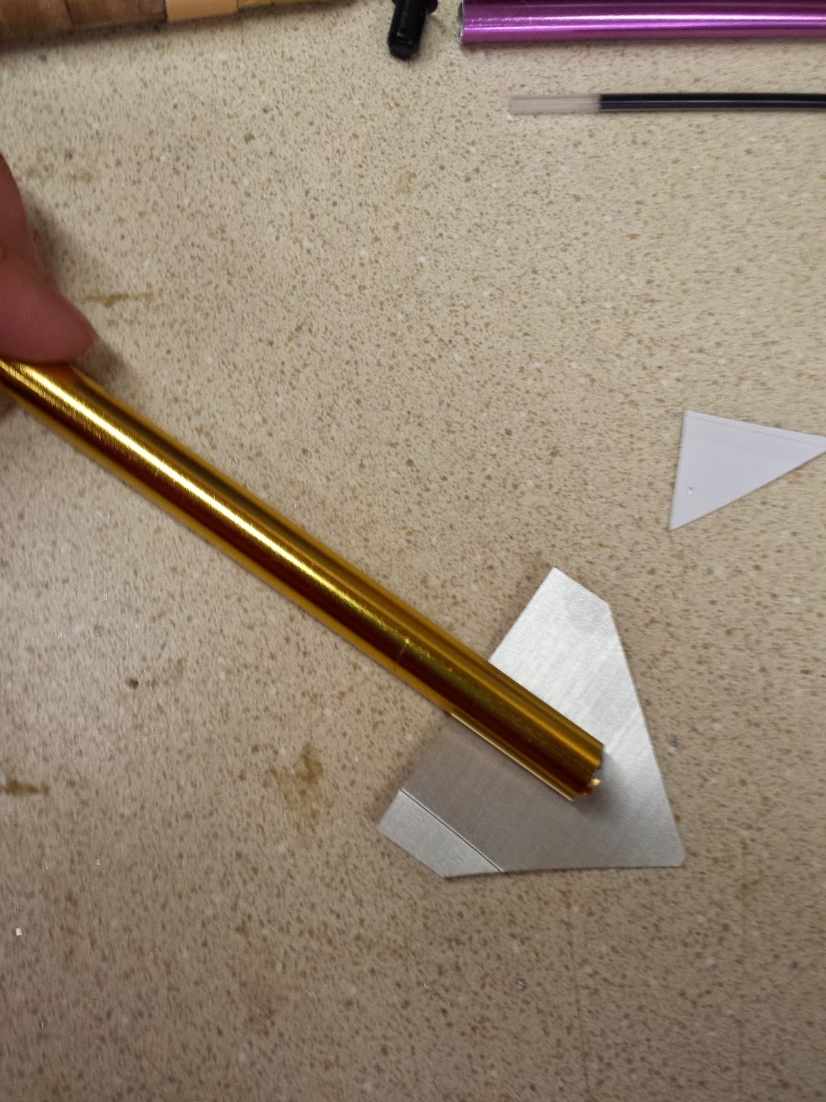
The hope was that we could place the tine sign over the lauan cutout and hammer along the edges of the border to create a raised edge. 
Below is the result. It turned out to be very difficult to hold the tin in place over the frame, and very difficult to use a consistent, even swing with the hammer to create the look of a machine punched sign. 
For attempt number 2, we decided that a fully dimensional sign wasn't really what we needed. Just a little bit of dimension and surface variation would probably work. We started over with a new piece of tin, this time with no paper under it. We discovered that a simple ballpoint pen was the perfect tool for creating enough pressure to leave a dent on the line, without risking punching a hole in the thin tin. To do this, we placed the tin on a sheet of foam, so that the pressure was against a softer surface and the tin was able to give way and create the dent we needed when we pressed down.
Since this method doesn't work at all of the design is printed out on paper and applied (the pen just causes the paper to scratch and peel away in places) we needed another method for getting the logos onto the tin. Here is our intern Shannon carefully tracing the logos onto the tin pieces using an overhead projector.
Once the logo was traced in sharpie, the next step was to trace it again with the pen, pressing down hard to create the dents along all the lines. 
Here is the Lone Star sign after pen tracing. 
After the sign was traced and cut out, we started with paint. I had some difficulty painting the Lone Star Sign, because the paint didn't want to stick to the smooth tin. As I tried to add second and third coats of paint, I kept accidentally rubbing away the previous coats of paint with my brush. 
Eventually, with a lot of patience, I was able to get three full coats of paint on the sign, and it looked pretty good. 
Learning from the mistakes of the Lone Star sign, we did things a bit differently on the Schlitz sign. First, I made sure that all of the sharpie lines had been scrubbed off before painting started (I had quite a bit of trouble with the paint absorbing the ink and staining all the way through on the first round). I also had Shannon use some steel wool to roughen up the surface of the tin so the paint would adhere better, and added some sealer to the paints so that the layers of paint might glide on a bit more easily. 
after both signs were finished, and sealed with several layers of spray shellac for shine, I came back with some rough brown rusty paint around the edges and in select other places on the signs to make them seem older and more beat up. 
And finally, here they are on set, collaged with other beer signs, our sconces, photos of other musical acts from the time, and lots of snapshots, postcards and news clippings.
And with our production manager Sarah pointing out her wedding photo that had made it onto the wall :)

Friday, September 5, 2014

Honky Tonk Sconces

These western honky tonk sconces were created for the production of Always...Patsy Cline running right now at Peninsula Players Theatre. I went into the process thinking I would purchase something, and very quickly discovered that nothing like the designer's research image existed anywhere I could find. 
I briefly toyed with the idea of purchasing a set of 6 of the most basic sconces I could find, and altering them, until the master electrician mentioned that he was hoping to clean out the chandelier stock this year. We were able to find a particularly ugly one (unfortunately I forget to get a photo) and cut the arms off of it, The resulting pieces, below, were my starting point. 
Cutting the pieces off resulted in some pretty bent up ends.
To flatten them out, I tightened each one as far as I could into the bench vice in the shop, resulting in nice flat metal arms. 
To create a more substantial base, we used these PVC reducing size connectors, painted copper. 
And used liquid nails to attach them to the lamp bases. 
This stamped metal grating is available in many hardware stores and is often used for radiator covers. I cut narrow strips of it, and then cut a pattern into the top. Then we wrapped it around the PVC pieces and secured it with a couple screws through the grate and into the PVC on the back side. 
To finalize the base, we needed one more horizontal layer. We cut some ethafoam insulation into quarters and painted it brown. Ethafoam does not take paint well, but I had heard that you could prep it for paint by spraying it with spray adhesive and then letting it dry completely until it isn't tacky anymore. I tried that this time and it worked beautifully. 
I secured the ethafoam with more liquid nails (and a rubberband to hold everything in place while the glue dried), and the base of the sconce was finished. 
For the shade of the sconce, I found these little tin bowls online. 
 We used a hole saw to cut a circular opening in the top and placed it on a stock glass hurricane. 
Finally we needed to mount the sconces to the wall. We cut six plywood circles and used the router to create a detailed outside edge. 
Then cut out the individual spokes of a wagon wheel. The metal chandelier arm was able to attach to the back side of the wagon wheel with a couple screws, and then we only needed one screw through the front when it came time to attach the sconces to the walls of the set. 
And here is the finished product, installed and all lit up. I think they are kind of hilarious and adorable. 

Monday, August 25, 2014

Printed Canvas Map

For Butler at Peninsula Players Theatre, we needed a canvas map to hang on the wall of the Civil War General's office. The set designer, Jack Magaw, provided the image and I had it printed on nice paper at Office Max, but it was still just paper. I needed it to be stronger, especially since it was going to be manipulated by the actors nightly. 
I purchased a piece of "duck cloth" canvas and used spray adhesive to attach the paper to the canvas, then went to the costume shop to borrow their serger sewing machine and serge the two layers together. 
Here is a close up of the two layers serged together from the front, 
 and on the back side. I am unsure of whether the method would have worked as well if I had printed the map on lower quality paper, but with the higher quality stronger paper, the sewing of the two layers together resulted in clean strong edges that I am confident will last throughout the run of the show. 
 To hang the map we purchased two 3/4 inch dowels and used the table saw to cut a groove into each. 
 We filled the gap with wood glue, slid the map into the slot, and then added brad nails to secure it in place. 
 The brad nails were a bit too long, so once the glue was dry we took the map over to the grinder to smooth off the ends on the back. 
 Here is the final piece laid out on the floor, ready to be hung on the wall of the set, and hopefully looking like it is ready to be rolled up and taken onto the battlefield. 
 And for good measure, and image of the canvas back side of the map too. 


Wednesday, August 13, 2014

Civil War Period Pen

Last week the stage manager for Butler at Peninsula Players Theatre asked me after rehearsal, "Greg wants to know if the General would be using a dip pen or a fountain pen." I started to answer and then realized, I had no idea. I told him I would do some research and then get back to them for rehearsal the next day. 
In my research I discovered that the fountain pens that we know of today were patented in the 1880s, about 20 years after our play took place. Prior to that though, many companies were creating their own versions of something similar. Designs hadn't been perfected yet and could sometimes be leaky, or write a bit inconsistently, but people were using them. Based on this information I told stage management that the actor was free to make the choice himself. 

He decided he would like to have a fountain pen, and then I set to work finding out what that would look like. As it turns out, examples of such pens are very hard to find. I ended up seeing three that all seemed to have this basic design. The body and the nib of the pen were very similar to a recognizable fountain pen (the first image has the nib removed). Then they have the long retracting plunger. It looks to me like this pen would be placed in a pot of ink, and then the plunger would be pulled back to draw the ink up into the reservoir. 

I was excited about my new knowledge of period pens, but at a bit of a loss for how to make one (purchasing is not an option, the one pictured above is on sale on ebay for $2200)
When scouting around for materials I came across these cheap aluminum knitting needles. I was able to buy several sets in different sizes so I could experiment with one fitting snugly inside another. After cutting a few apart, I discovered this purple and gold combination was the best. 

 I cut the needles to the length I needed, leaving the end on the purple one. 
 I wrapped the end of the purple needle with just a bit of tape to ensure a snug fit. 
We wanted to make sure that our pen was still functional, so I took apart this cheap ballpoint pen to use the ink. 
 And slid it into the center of the tubes. These photos are from the second pen I made. When I made the first one I had to experiment a bit with the length of the tubes so that inner purple tube didn't get caught on the ink after it was pulled out. 
 To make the pen nib I cut a triangle shape from some metallic gold contact paper we had in stock (also seen in the previous pic).
 I simply wrapped the tape around the pen base to form a fairly convincing nib. 
  I then filled in the nib with hot glue, to make the nib more sturdy and to hold the ball-point ink in place.
 I used this wood-grain contact paper to add a bit of visual interest to the center of the pen.
 Like so
 Then used strips of the same gold contact paper to add these three stripes. 
 A bit of gold paint to cover the purple needle and the hot glue on the pen nib, and the project is complete.
Here are the two finished pens, and below is the research image. Not very far off, and from a distance, rather convincing.